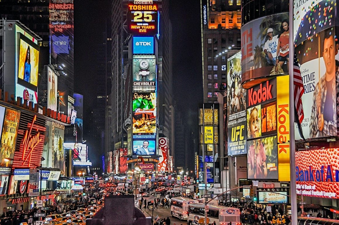
Advertising is a cutthroat industry. And with that comes the need to create ads that communicate effectively to consumers. Design is the engine that makes advertising work, and it is critical. Design is more than just throwing a photo of your best product up. It incorporates all the different aspects of design theory to create cohesive and often imaginative designs. There are many different types of advertisement boards, and you’ll benefit from creating designs that are uniquely made for the board it’ll go on. These are the most important design elements that will help your ads stand out and get your company noticed.
Color (or No Color)?
Color theory is an important part of design when it comes to ads. Different colors make you feel a certain way and by using them in various ways in your designs, you’ll evoke various responses from the people who view your ads. Complementary colors and monochrome designs can make your ads feel more cohesive. Contrasting colors can create a disjointed feeling and make people stop and think about what you are showing them. This can trigger a more memorable connection to your business.
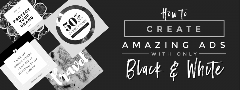
No color is just as important as color. Black and white advertisements can stand out in a sea of bright colors so that it alone makes you shine. The shades of gray, black and white work together to sometimes feel more vintage and can act as a reminder of times past.
Fonts and Typefaces
The type of fonts and typefaces you use is critical. Not only should it be something that coordinates with your brand, if you choose to put words on your ads, they should be legible. You’ll miss out on opportunities to drive customers to your business if they can read what it says because the writing is too busy or hard to decipher.
Use Humans
Ads that incorporate people elicit a strong emotional response. When you show people in neighborhoods, or enjoying your product, or in buildings, it personalizes what you offer. The best soap ads for instance always incorporate people. Why? Because people use the product. They don’t just show a bar of soap on a soap rack, they show someone showering and the way it bubbles. They show someone inhaling the aroma of the bar. Humans help in many different types of ads.
Give a Nod to Location-Based Businesses
Are you located in a certain region? Do you provide services to people in your area? Then use design elements to give a nod to your location. An advertisement for vacation rental for instance should speak to the location in a unique way. Whether it’s a composite of the door frame blended with a cityscape nearby, or it’s a bar of soap with the city in the background, you’d be amazed at all the strategic ways to show location.
Mix Ideas
Want to make a point with your ad? Mix ideas that don’t seem like they belong together. The contrast will affect people in ways that make your business more memorable. One trend recently has been to turn everyday objects into animals. This contrast between man-made and nature can make a statement or just be silly and exciting to look at.
Use Digital Art, Not Just Photographs
While an ad in a fashion magazine may simply be a photograph, other types of ads turn photos into digital art. The distinction comes in the post processing. It’s not simply editing a photograph but turning an image or images into something new. It may even be fully created by a digital artist without using any photographs in the process. When you add elements of digital art, you can create new places, new ideas, and new themes using only your imagination.
White Space
What you don’t put in an ad is equally as important as what you do put. White space isn’t forgotten. It’s an intentional part of design. The simplicity of white space speaks volumes. It draws people’s eyes in a particular direction and forces them to look at what it on the ad. Use white space to make a point. Use it to create a compelling message. Use it to tell your story. While it may feel important to fill up every square inch of your ad with something, resist the urge. Don’t forget how valuable that white space can be.


